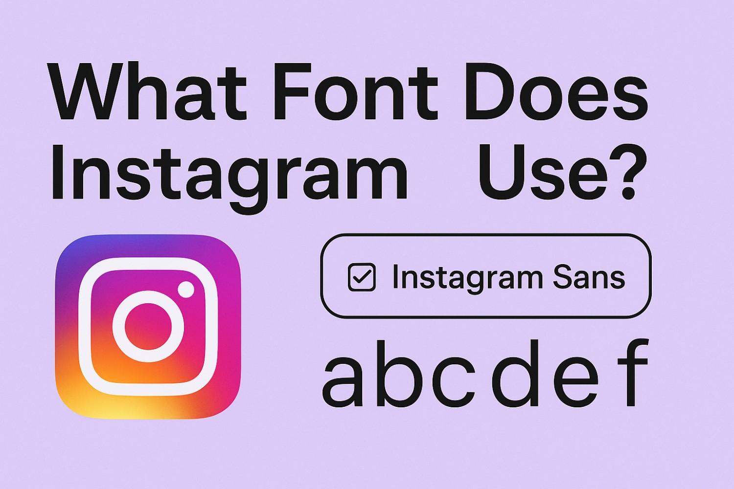
When I first started designing social content, one of my biggest questions was “what font does Instagram use?” I wanted my visuals to match the clean, modern aesthetic that makes the platform instantly recognizable. If you’ve ever tried to create branded posts or mock-ups inspired by Instagram, you’ve probably wondered the same.
Let’s break down exactly what fonts Instagram uses today, where they appear, and how they evolved over time — with a designer’s perspective on why these choices matter.
Why Instagram’s Font Choice Matters
Typography isn’t just decoration. It’s a brand personality in letters. For Instagram, fonts have played a crucial role in expressing its evolution — from a nostalgic, handwritten look in the early 2010s to a sleek, digital-first identity that feels universal.
Every major update — from the old Billabong logo to today’s Instagram Sans — tells a story of how the platform grew from a photo-sharing app into a global community for creators, brands, and conversations.
What Font Does Instagram Use Now?

Image source: OnlyOffice
In 2025, Instagram uses a combination of fonts depending on where you see them:
| Usage Area | Font Name | Platform | Description |
| Logo & Branding | Instagram Sans | All | Custom geometric-grotesque typeface introduced in 2022 |
| App Interface (iOS) | San Francisco | iOS | Apple’s system font — clean and highly legible |
| App Interface (Android) | Roboto | Android | Google’s system font — balanced and modern |
| Older Web & UI Versions | Proxima Nova | Web (pre-2022) | Once the main Instagram typeface before the rebrand |
Each of these fonts has its own story and purpose — let’s dive into each.
What Is Instagram Sans?
Instagram Sans is Instagram’s official custom font introduced during the 2022 rebrand. Designed in collaboration with the Colophon Foundry and Instagram’s in-house brand team, it reflects the platform’s goal of being more inclusive, global, and expressive.
A Blend of Geometric and Humanist Styles
Instagram Sans merges clean geometric forms with softer, humanist curves — creating a look that feels both technical and approachable. You’ll notice its subtle rounded edges and high legibility at small sizes, ideal for digital screens.
Built for Global Communication
Instagram designed this font to work across multiple alphabets and scripts — Latin, Arabic, and many others. This aligns with their mission of connecting billions of users worldwide.
Available Variations
- Instagram Sans Regular – used for body text and UI labels
- Instagram Sans Headline – bold, expressive version for titles
- Instagram Sans Condensed – space-saving variant for narrow areas
So next time you see an Instagram campaign, Story sticker, or ad, chances are you’re looking at Instagram Sans.
What Font Does Instagram Use on iPhone?

Image source: Storefries
If you open Instagram on an iPhone, the text inside the app — captions, buttons, menus — uses San Francisco, Apple’s default system typeface. It’s not unique to Instagram, but it perfectly matches Apple’s clean aesthetic.
San Francisco (often abbreviated as SF Pro) is designed for clarity and modernity. It dynamically adjusts letter spacing to improve readability, which is why it feels effortless to read on small screens. It’s also used across iOS apps like Messages, Mail, and Safari.
What Font Does Instagram Use on Android?
On Android, Instagram follows Google’s design system and uses Roboto, Android’s default system font. Roboto, created by Christian Robertson for Google, blends the precision of geometric sans-serifs with friendly curves.
It’s highly legible even at small sizes, which makes it perfect for mobile UIs and continuous scrolling — exactly what Instagram’s feed demands. Using system fonts like Roboto helps keep the app lightweight and consistent with Android’s design language.
What Font Did Instagram Use Before Instagram Sans?

Image source: Superside
Before the 2022 rebrand, Proxima Nova was Instagram’s primary font across its web and app interfaces. Designed by Mark Simonson, Proxima Nova offered a balanced, approachable sans-serif look that fit the early social-media era.
Even before that, the Instagram logo itself was written in Billabong, a retro script typeface that gave the app a nostalgic “California postcard” vibe. It matched the early Instagram aesthetic — warm filters, Polaroid frames, and personal snapshots.
Here’s how the evolution unfolded:
| Period | Font | Use Case | Notable Trait |
| 2010–2016 | Billabong | Logo | Handwritten, nostalgic script |
| 2013–2022 | Proxima Nova | Interface & web text | Clean sans-serif; neutral and flexible |
| 2022–Present | Instagram Sans | Logo, branding & visual assets | Custom, global typeface |
Why Instagram Moved Away from Proxima Nova
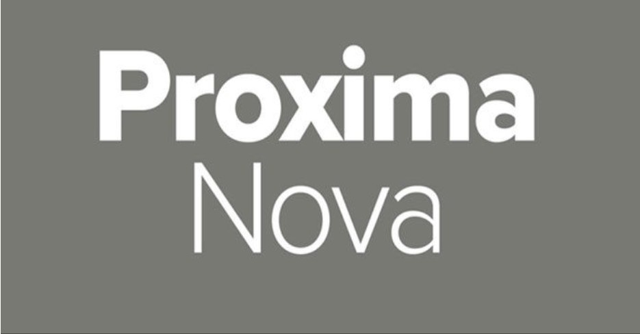
Image source: Designyourway.net
Instagram’s growth demanded a stronger visual identity — one that felt unique rather than borrowed. While Proxima Nova served well during Instagram’s expansion years, it wasn’t proprietary. Many other brands used it too.
By developing Instagram Sans, the company gained full creative control. They could tweak spacing, shapes, and alignment for better usability — and most importantly, own a typeface that truly represented their brand voice: creative, inclusive, and human.
Can You Download or Use Instagram Sans?
Yes and no.
Instagram Sans is publicly viewable through Instagram’s design page, but it’s not available for free commercial use. The font is proprietary and meant exclusively for Instagram’s own branding and communication materials.
If you’re designing for a brand or social media campaign and want something similar, consider these Instagram Sans alternatives:
| Font | Similarity Level | License Type |
| Proxima Nova | Very High | Paid (Commercial) |
| Circular Std | Moderate | Paid |
| Nunito Sans | Moderate | Free (Google Fonts) |
| Poppins | Moderate | Free (Google Fonts) |
| Inter | Slightly Similar | Free (Google Fonts) |
These options offer clean, modern lines and good readability — ideal for digital use.
Why System Fonts Still Matter in the App
Image source: Storefries
Even though Instagram created its own brand font, it continues to rely on system fonts (San Francisco and Roboto) inside the app itself. Why? Performance and user familiarity.
- Speed: System fonts don’t need to be loaded from servers, keeping the app fast.
- Clarity: Users already recognize these fonts from their device ecosystem.
- Accessibility: Both Roboto and SF Pro are optimized for small screens and screen readers.
That balance between brand personality (Instagram Sans) and functional simplicity (system fonts) is what makes Instagram’s overall typography successful.
Typography Beyond the Interface: Stories & Reels
If you’ve experimented with Instagram Stories, you’ll know that the text tool includes several type styles — like Classic, Modern, Typewriter, and Strong. These are custom UI styles, not necessarily exact font matches to Instagram Sans.
However, you can see the visual influence — rounded terminals, balanced proportions, and easy readability even over images or videos.
Expert Takeaway: Why Instagram’s Font Works
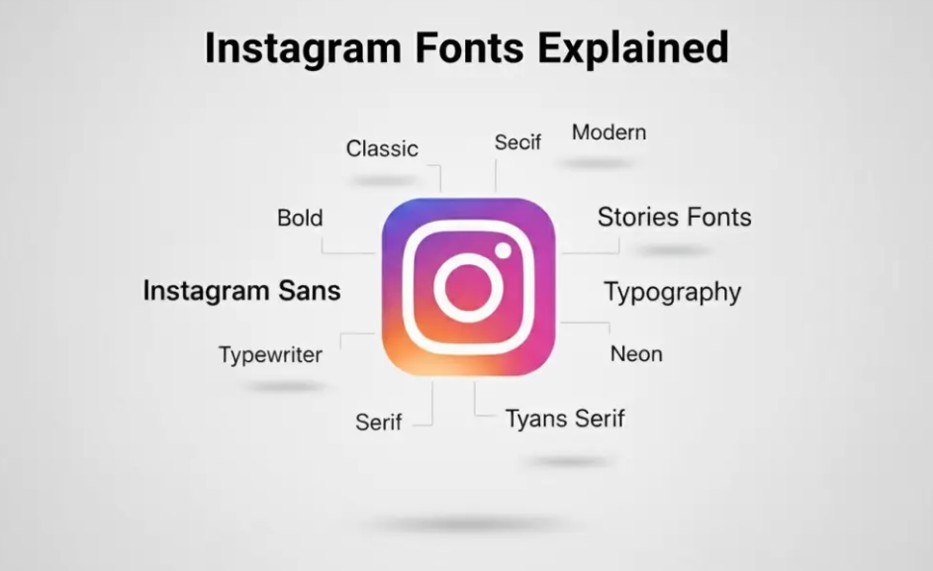
Image source: Instagram Bio
As a designer, I think Instagram nailed the delicate balance between distinctiveness and universality. Instagram Sans gives them a recognizable, ownable identity across marketing and web materials. Meanwhile, the use of Roboto and San Francisco ensures functional efficiency within the app.
Together, they reinforce Instagram’s identity as both a global tech platform and a creative space for personal expression.
Frequently Asked Questions
1. What font does Instagram use for its logo?
Instagram uses Instagram Sans, introduced in 2022, replacing the old Billabong script logo. It’s clean, geometric, and designed for modern branding.
2. What font does Instagram use for posts or captions?
In the app, captions and menus use system fonts — San Francisco on iPhones and Roboto on Android devices.
3. Can I use Instagram Sans for my own designs?
Instagram Sans is proprietary, but you can view it on Instagram’s official branding page. Alternatives like Poppins or Proxima Nova are great for similar aesthetics.
4. What font was used before Instagram Sans?
Instagram used Proxima Nova for years in its app and web UI, along with the Billabong script logo before the rebrand.
5. Is Instagram Sans available on Google Fonts?
No, it’s not. But free fonts like Poppins or Nunito Sans offer a close, modern look.
Final Thoughts: Clean, Global, and Instantly Recognizable
So, what font does Instagram use?
In short — Instagram Sans for its branding, San Francisco for iOS, and Roboto for Android. The combination keeps the platform stylish, consistent, and inclusive.
Instagram’s typographic journey mirrors its transformation: from a playful photo app to a universal stage for creativity. And while you may not have direct access to Instagram Sans, you can certainly channel its spirit — clarity, warmth, and authenticity — in your own designs.